To view the graph data for a Sensor click the ![]() icon for the sensor on the Live View, or double-click on the Sensor Name to give the same graph in its own window. See below for an example graph.
icon for the sensor on the Live View, or double-click on the Sensor Name to give the same graph in its own window. See below for an example graph.
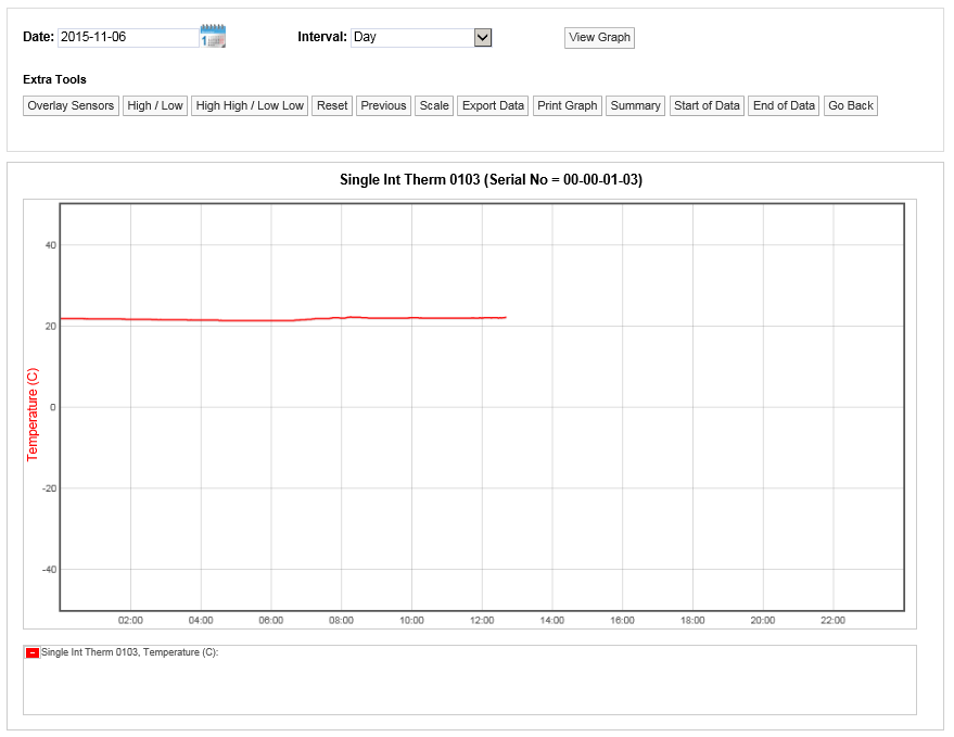
Line Graph, Temperature Data
Here, the graph shows live temperature data, starting at midnight for the 'Single Int Therm 0103' sensor. Summary data in textual form is shown in the display box under the graph area.
Double-click on the Sensor Name in the Viewing Live Data list to give the same graph in its own window.
An example of a graph for a two-channel sensor might be as shown below:
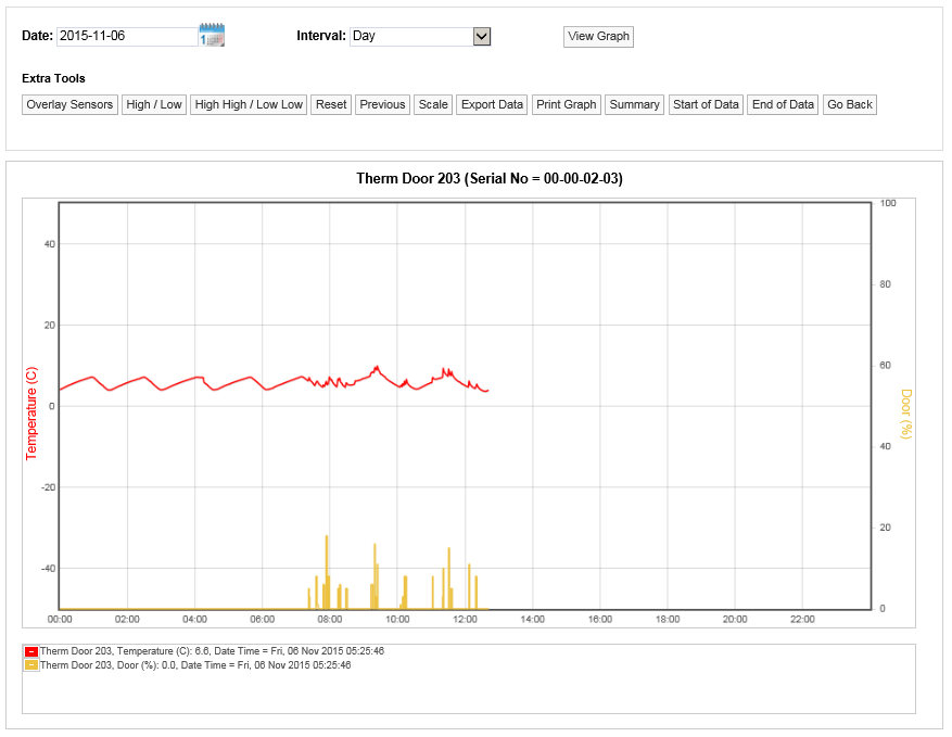
Line Graph, Temperature Data and Door State Data
Here we see temperature data in red, door data in yellow. The door sensor graph line indicates the percentage of time in each data period that the door was open. This could be one continuous period or an accumulation of several periods.
Display Time Spans
The graph window defaults to displaying the current day’s data.
To change the date range for the graphing period, use the Date and Interval controls, see below.

Select the calendar icon to change the data graphing start date, this is the data that the graph will start from, see below.
![]()
The date has been changed to the 8th July 2015. To view data for one week (commencing 12th of October 2015) use the Interval drop down menu and select Week, see below.
![]()
Click on ![]() to generate the graph, see below for example.
to generate the graph, see below for example.
To view data for a month follow the steps above, selecting a date from the calendar that is a month or more prior to the current date, set the Interval to Month and select ![]() , see below.
, see below.
Using the tools above the graph window the following functions can be performed.
Overlay Sensors
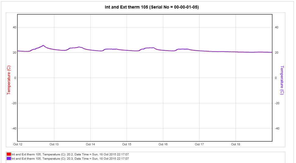
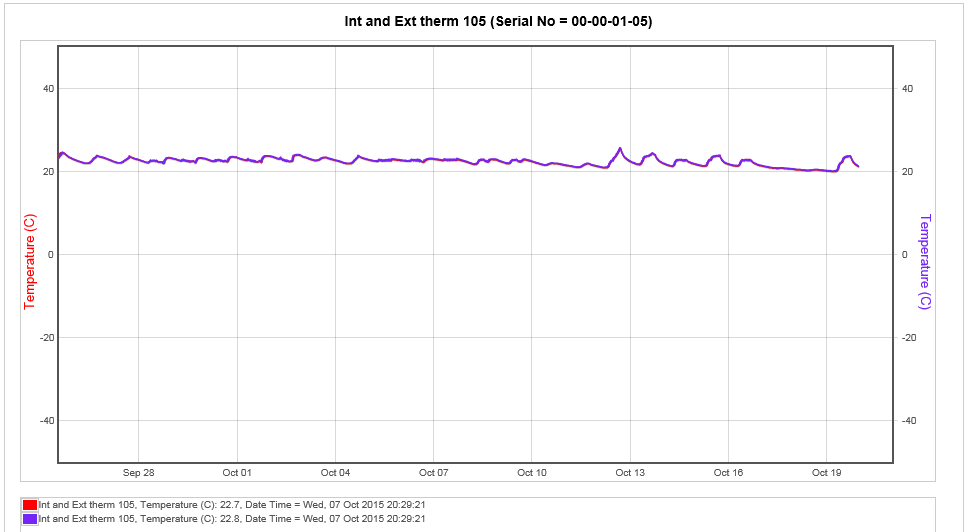
This feature allows the comparison of one or more sensors. This is particularly useful if you have an outdoor sensor and want to see if the outdoor conditions are driving the conditions indoors. To overlay sensors, in Live View select Overlay Sensors from the bar menu in the Live View window. A new window called Select Sensors to Overlay Graph will appear, see below.
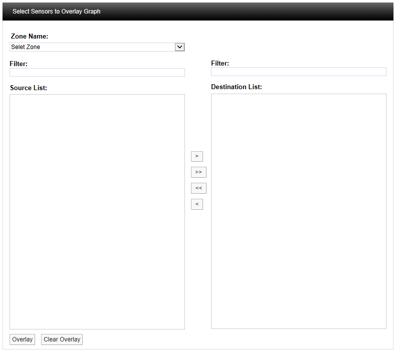
Select the Zone containing the relevant sensors from the Zone Name: pull-down list. See below.
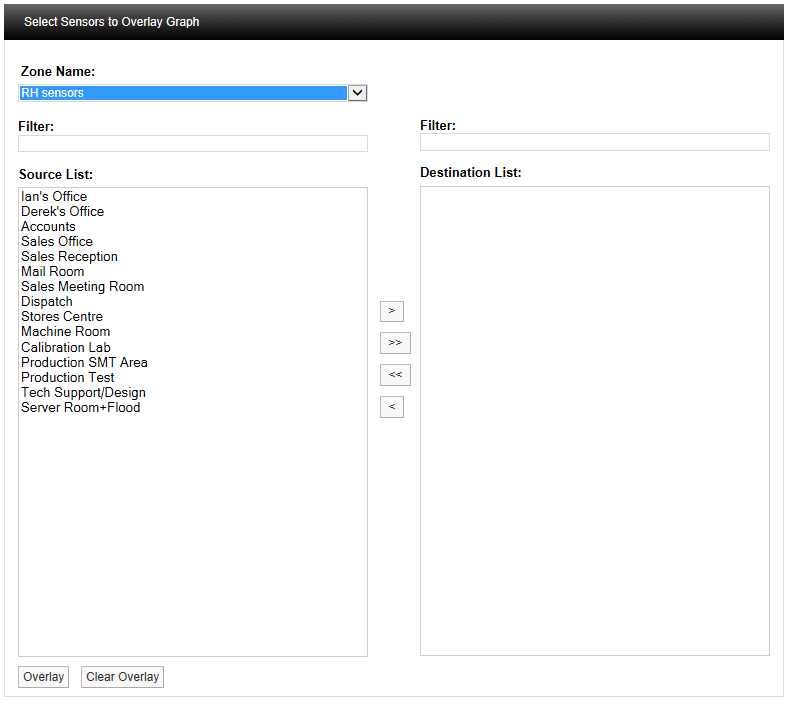
Select the sensor(s) you require from the Source List then click ![]() . To select more than one sensor, hold down the Ctrl key as you select the sensors, then click
. To select more than one sensor, hold down the Ctrl key as you select the sensors, then click ![]() . See below.
. See below.
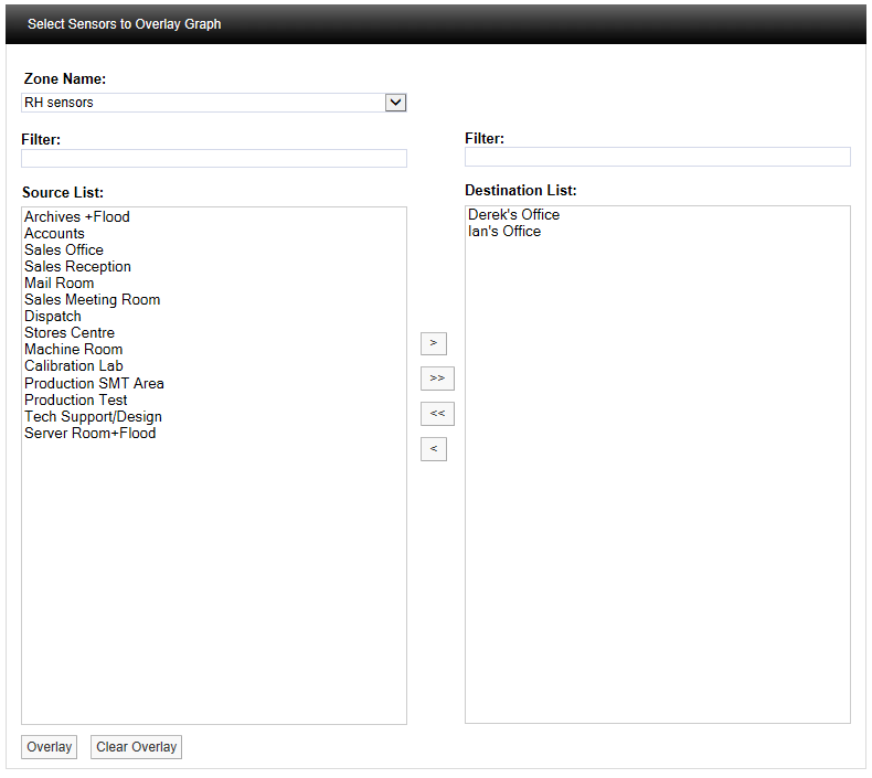
Once you are happy with your selection, scroll to the bottom of the list and select Overlay, see below.

After selecting Overlay you will be asked to confirm your selection, see below.
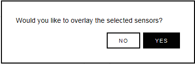
Select YES to confirm and to proceed with overlaying data. The graph window will re-appear with the selected Sensors overlaid over the original graph, see below.
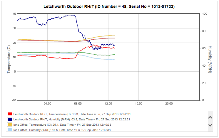
The coloured key below the graph window clearly identifies the overlaid data traces. To see all the key information use the scroll bars to view the lower data. To view specific values on the graph a cursor can be applied, to use the cursor move the mouse pointer over the graph window and the cursor will appear, see below.
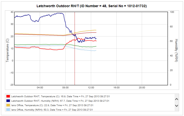
Keeping the mouse pointer within the graph window, move the mouse to the left and right to move the cursor across the screen. As the cursor moves you will see the sensor values, along with the date and time, changing.
You can see from the above that as the outside temperature (red trace) increases the two indoor temperature traces (salmon and mustard) are moving up as well. This indicates that the equipment controlling the indoor space is not powerful enough to overcome the effects of the outside temperature changes.
To remove the overlay select the Overlay Sensors button and scroll to the bottom of the Sensor list and select Clear Overlay, see below.

The graph data will return to the original data.
High Low Alarm
This feature allows the levels for alarms to be overlaid on the graph. To use this feature alarm levels will need to be set, see Add Sensors for how to set alarms.
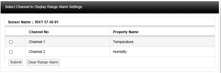
Click on the High Low Alarm button, then the Select Channel to Display High / Low Alarm Settings window appears, see below.
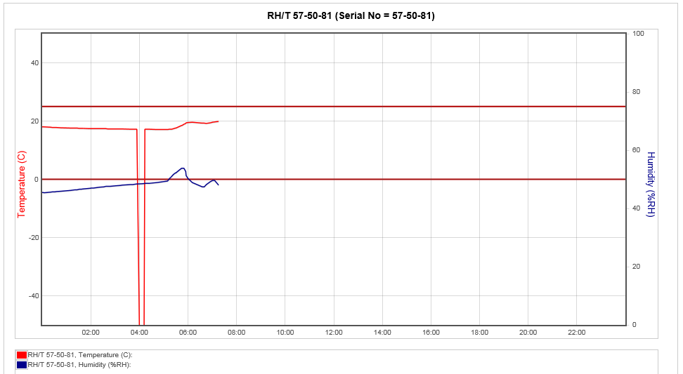
To bring on the temperature range alarms select the option button next to Channel 1 and select Submit. Lines representing where the range alarm levels are set will appear on the graph, see below.
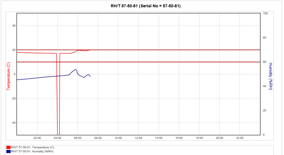
This gives a clear visual indication if there has been an excursion either above or below the range alarm settings.
To clear the Alarm select High / Low Alarm from the graph window, the Select Channel to Display High / Low Alarm Settings window will appear again, this time the Channel that has been put on the graph will be highlighted. See below.
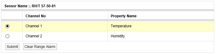
Select Clear Range Alarm to remove the Range Alarms from the graph.
High High / Low Low Alarm
This feature has the same function as the High / Low Alarms only this time the High High and Low Low alarm levels are overlaid on the graph. Level Alarms are set in a similar way to Range Alarms. To start the routine, select High High / Low Low Alarm from the toolbar above the graph window. See Add Sensors section for setting alarm levels (System Administrator Users Only).
The result here might be as shown below.
(Temperature has gone below the Low Low setting in the above example).
Reset
This function will clear the graph window back to the default view regardless of where you are. The default view is the current date with one day’s data displayed. To reset the graph select Reset from the menu above the graph window.
Previous
The Previous function steps you back through the data one graph span at a time. If the Interval is set to Day then the graph will step in days, Week and it will step in weeks, Month it will step in months.
Next
The Next function steps you forward through the data one graph span at a time. If the Interval is set to Day then the
graph will step in days, Week and it will step in weeks and Month it will step in months. When a graph is first generated the Next button won’t be visible as there is no future data to display. Once you select a time to graph in the past the Next button will appear.
Scale
The configuration of the graph Scale is selectable. There are three methods of selecting the graph Scale. To change the Scale select Scale from the menu above the main graph window. A new window called Graph Scale will appear, see below.
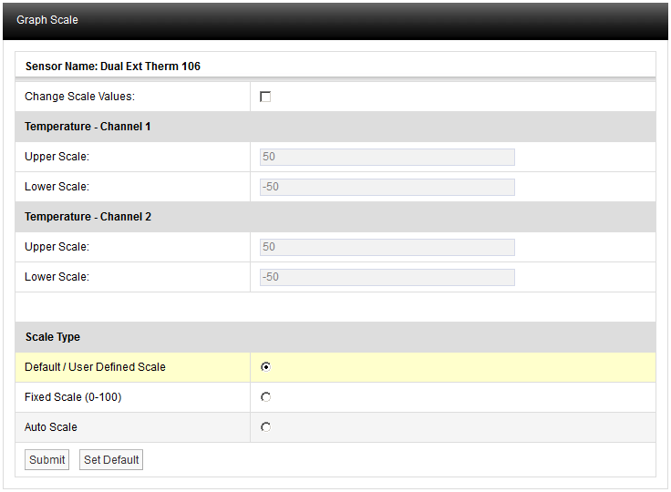
Default/User Defined Scale
You can define a default Scale for each Sensor on the system. The User Defined Scale can be set here or in the Calibration page see Configuring Sensors. Some Sensors have a very wide operating range but the Sensor in question may be being used at one end of the range. A User Defined Scale allows a more detailed view of the data.
Fixed Scale (0-100)
Each Sensor installs with a Default Scale which would cover the maximum range for that Sensor. This is Scale setting is OK if the Sensor is going to be used over its range. If it’s to be used over a smaller range then a User Defined Scale may be more appropriate, see above.
Auto Scale
This feature allows the graph Scale to be set automatically. Auto Scale will set the graph Scale to a very tight range which covers the range for the data displayed. This gives a much expanded view of the data and may be confusing as the data can look like it is changing dramatically.
Select the Scale type you require by clicking the option button next to the Scale Type and select Submit. The graph will re-draw with the new Scale settings, see below.
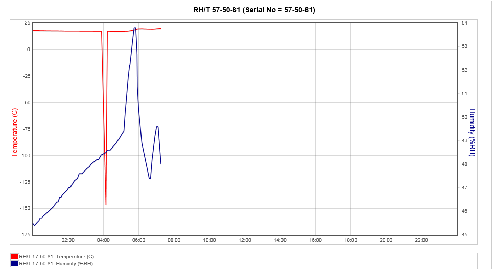
The User Defined Scale for this Sensor is -40°C to +40°C and 0% to 100% Relative Humidity. Using Auto Scale has rescaled the graph to 150°C to 23°C and -165% [theoretical] to 20% Relative Humidity.
Export Data
The data associated with Day and Week interval graphs can be saved as a comma separated variables file, (.CSV). The entire Day or Week’s data will be exported, irrespective of the current zoom state when the data is exported. To export data click Export Data.
Once clicked you may be asked to choose between saving the file and opening with your computer’s default spreadsheet application (see below). However, the exact action will depend on the browser you are using, the default settings for your browser and the computer operating system and its setup. If you require assistance with this contact your system administrator or IT support provider, please do NOT contact Ellab Monitoring Solutions Ltd Technical Support, as this is help that only your administrator/support provider can supply.
Print Graph
The Print Graph function allows you to export a picture of the graph (line or bar chart) in .pdf format. Clicking on the Print Graph button gives the browser’s standard “Do you want to open or save . . .” window. (Example below is for Internet Explorer.)

Clicking Open displays the graph in a .pdf window, with Hanwell headers and footers:
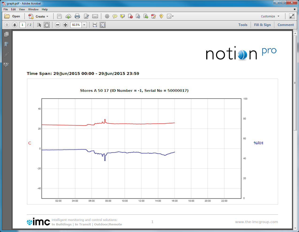
Select File>Save As… to save the file to your desired location with name graph.pdf, renaming the file if required.
Start of Data, End of Data
Select Start of Data to change the graph display to the date/time when data was first recorded by the sensor. End of Data returns the display to the show data at the current date/time.
Go Back
Click this button to go back to the Live View display for the Zone at the top of the Live View list. See also Viewing Live Data.
Zooming In
The graph can be zoomed by using the mouse. To Zoom in on a section of the graph place the mouse cursor at the place where you want to Zoom in on, click and hold the left mouse button and move the mouse to cover the section of the graph to Zoom in on.
When the area required is highlighted release the left mouse button, see below.
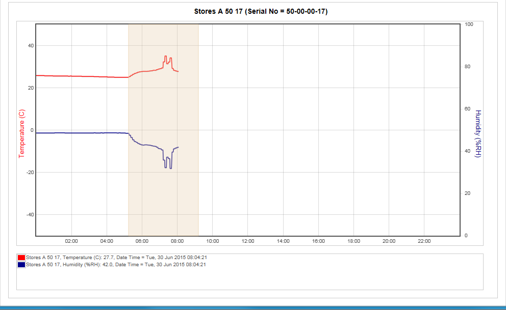
The graph will re-draw, zoomed into the area selected, see below.
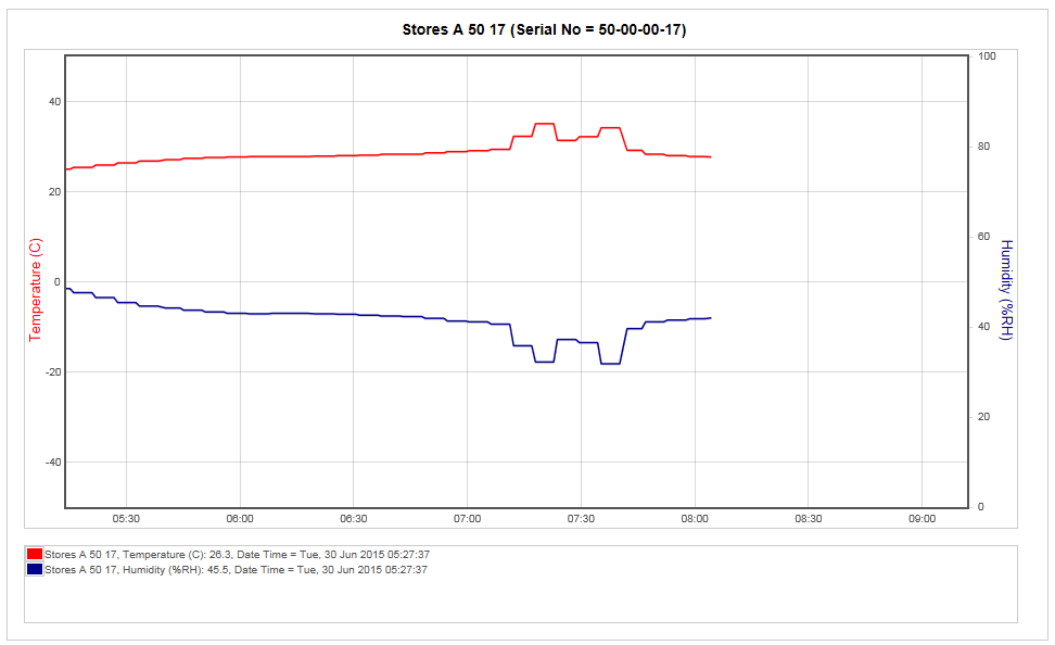
Once the graph has been zoomed a new button (Zoom Out) will appear on the graph toolbar, see below.
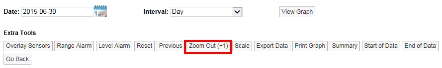
The new button will Zoom the graph out. You will see that Zoom Out is followed by a number in brackets. In the example above (+1) tells you that the graph has been zoomed one time. If the number in brackets was (+3) that would indicate that the graph has been zoomed three times.
Clicking the Zoom Out button once will take you back one step. To go back to no Zoom in one step you can select Reset. Once the graph has been returned to an un-zoomed view the Zoom Out button will disappear.
Graph Title
The graph title appears above the graph and is auto generated by the system. The name consists of the Station name allocated by the user when the Sensor was added to the system and the serial number, see below.
